



 Kitty HawkBrand · Packaging · BNA, Nashville
Kitty Hawk
Naming, identity, packaging and in-store branding for Kitty Hawk Eat + Drink, a Strategic Hospitality restaurant at Nashville International Airport.
Opened September 2023- Client
- Strategic Hospitality
- Where
- Nashville International Airport (BNA)
- Opened
- September 2023
- Our part
- Name, concept, identity, packaging, print and merchandise
Named for the first flight
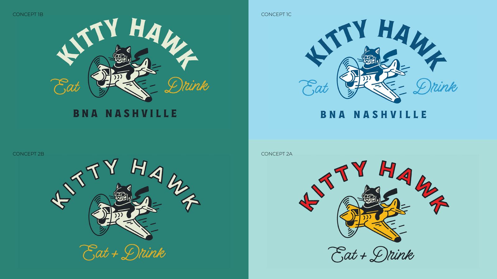
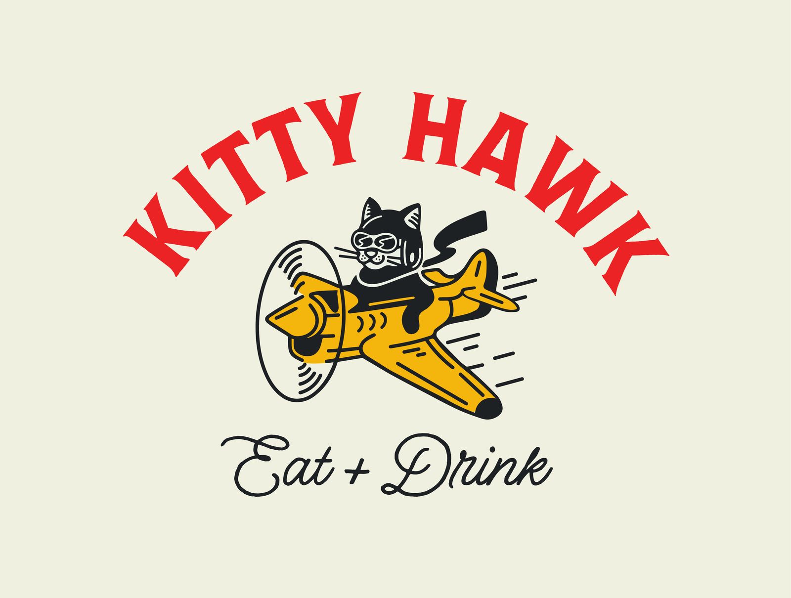
Kitty Hawk takes its name from the first flight at Kitty Hawk, North Carolina: a fitting name for a restaurant inside an airport. We developed the concept and the name with Strategic Hospitality, then gave the brand its pilot, a cat at the controls of a vintage plane.
One mark, a complete system
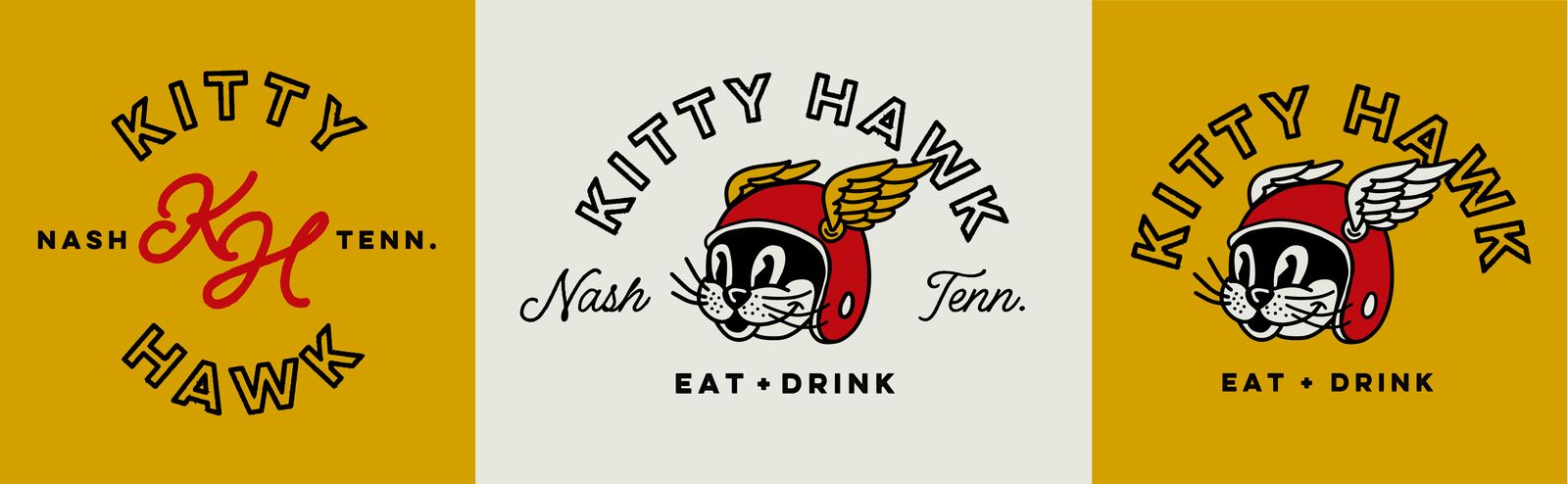
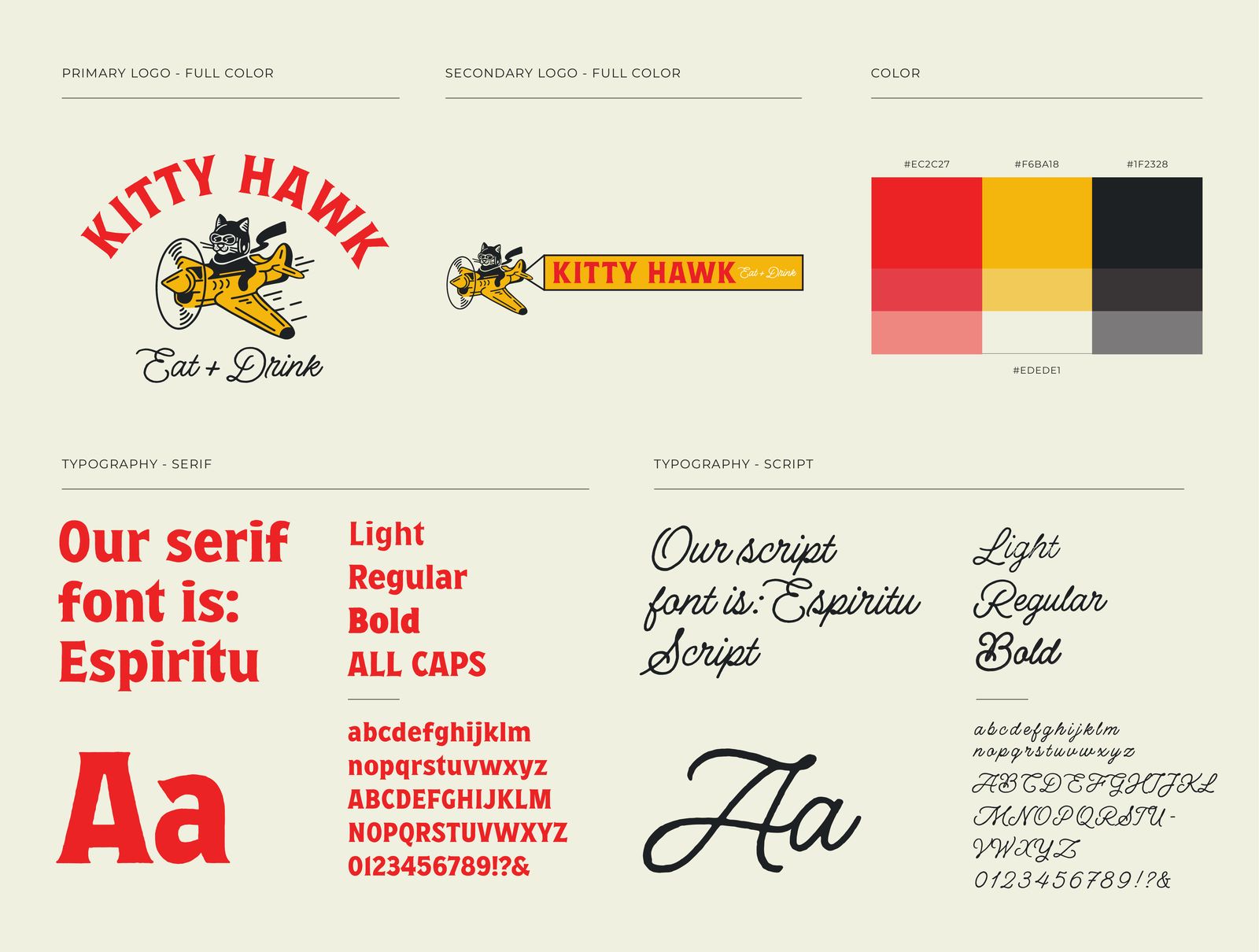
A primary mark with secondary lockups, a red, yellow and black palette, and a serif paired with a script, set down in a brand guide so the system holds up wherever it is printed.
The brand, built into the room
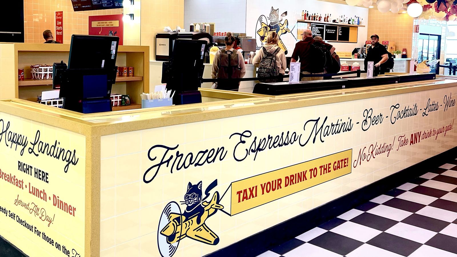
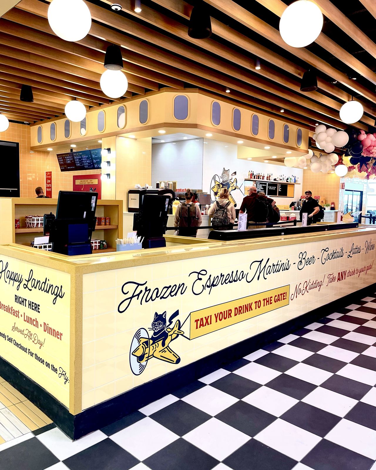
We helped select the restaurant’s finishes, tile included. The counter front carries the brand’s script, its colors and its pilot.
From the wrapper to the tote
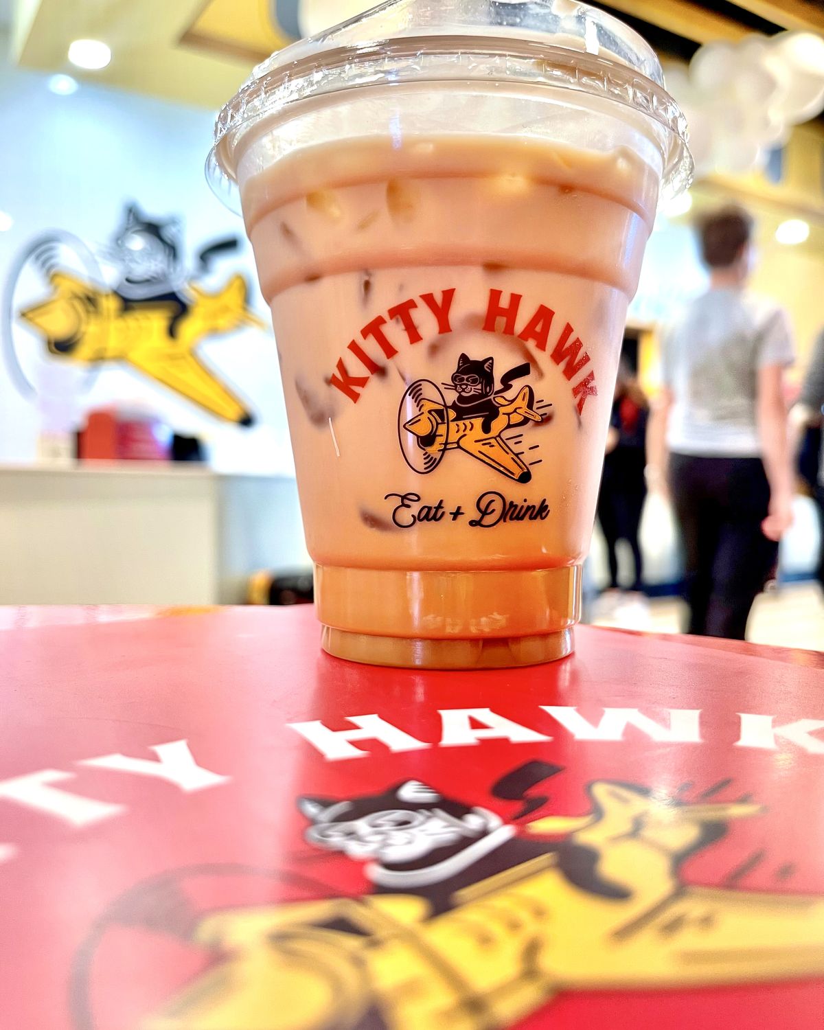
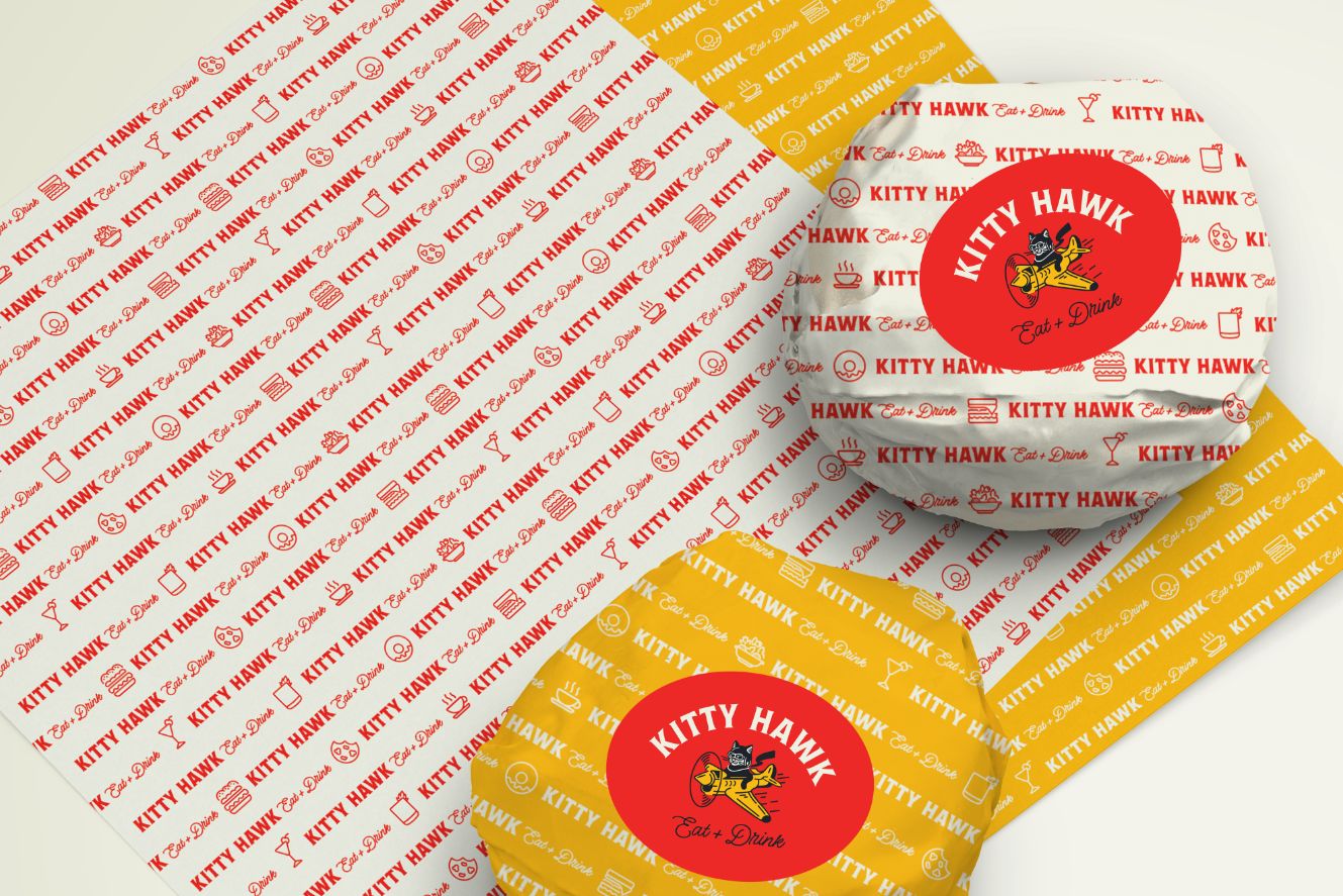
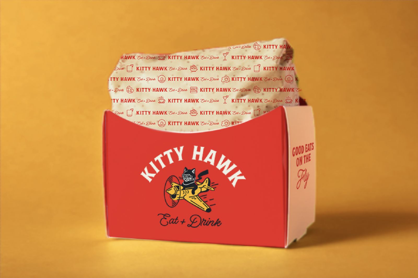
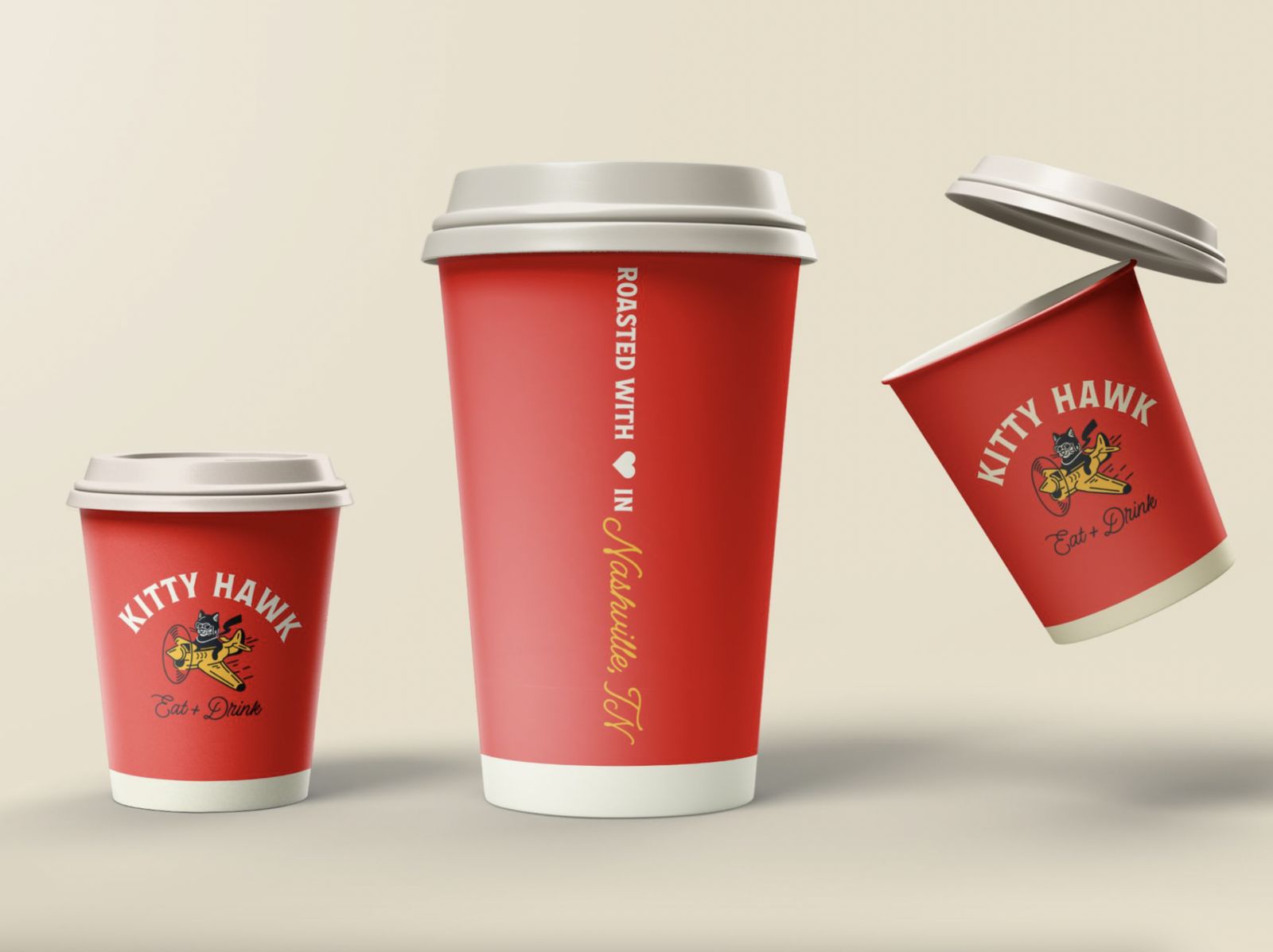
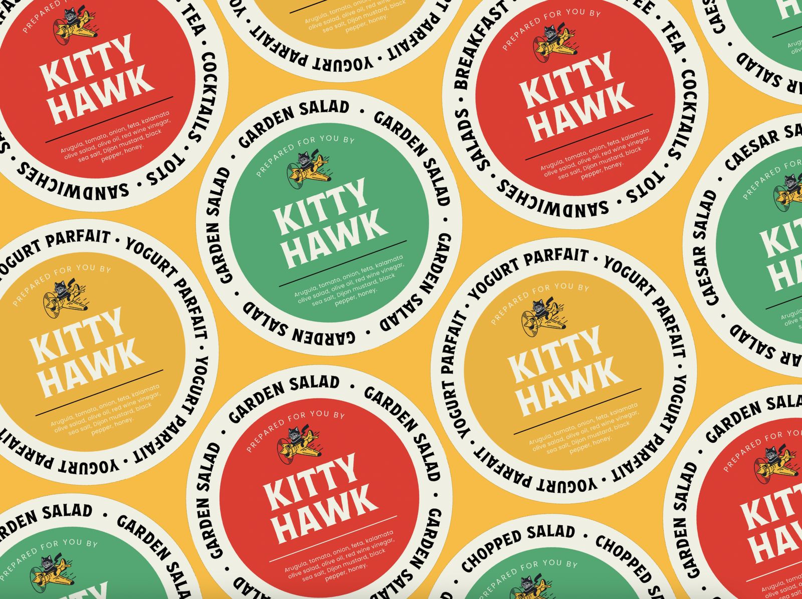
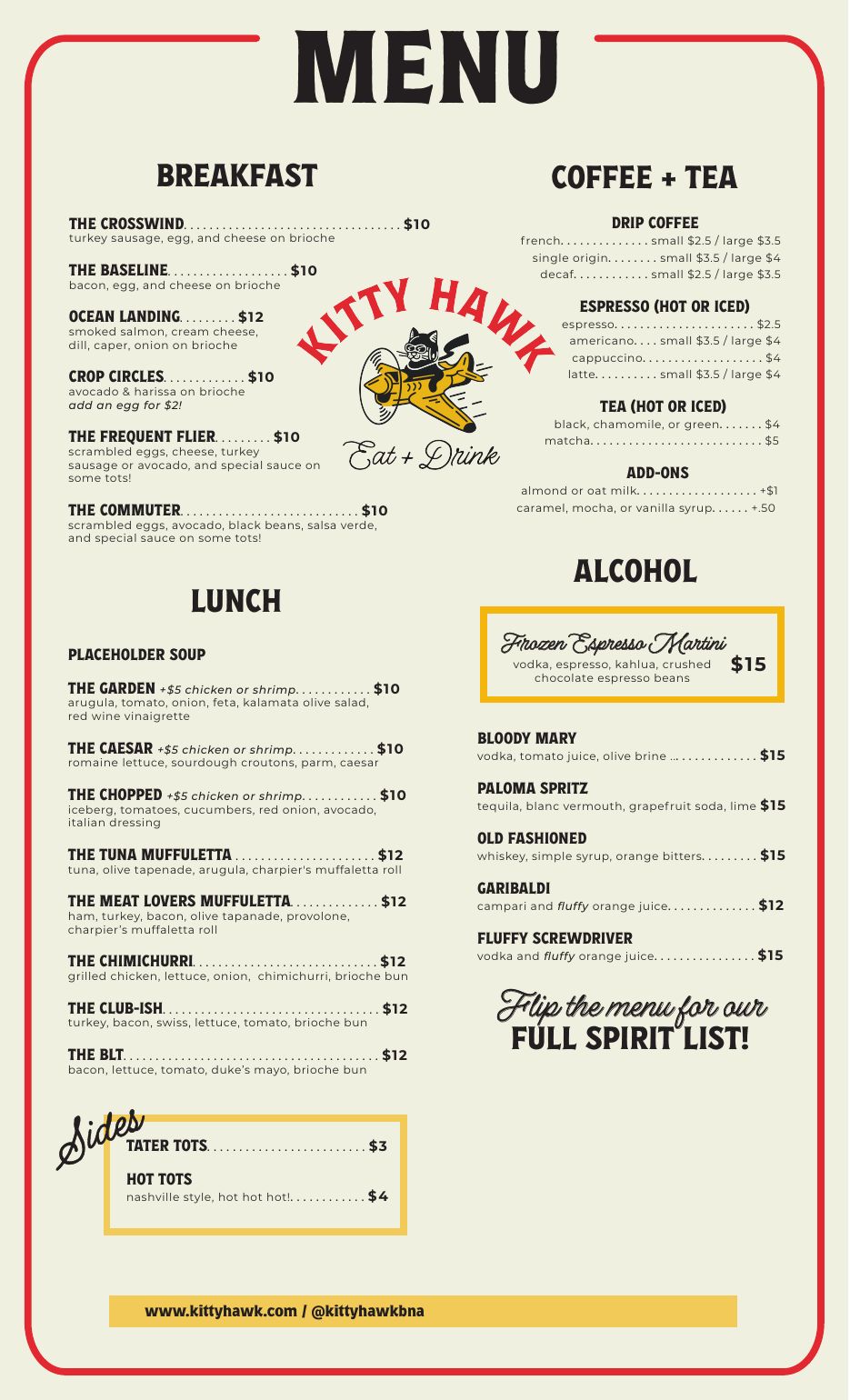
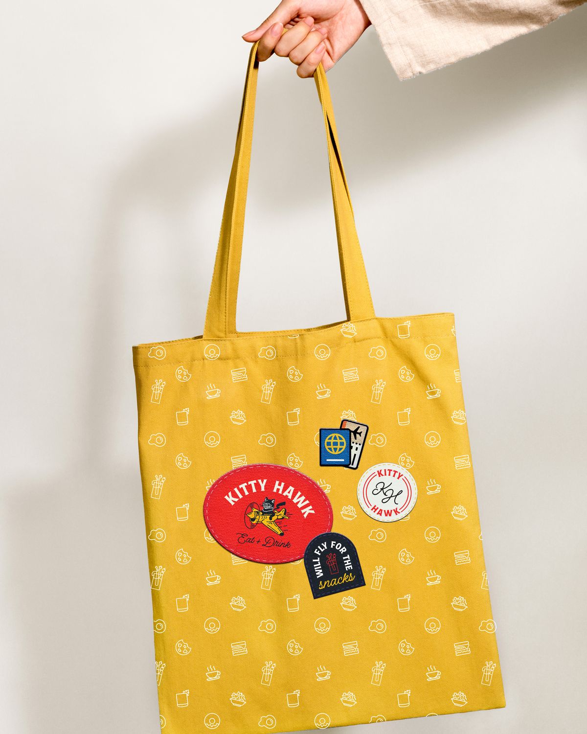
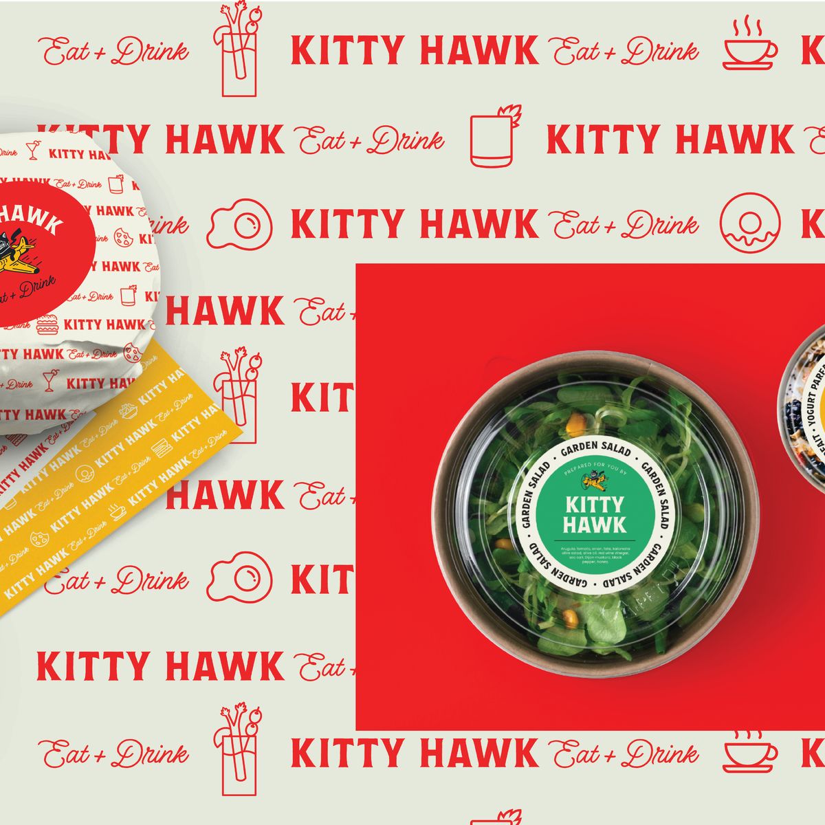
Burger wrappers, deli paper, sandwich boxes, cups, grab-and-go stickers, the menu and the merchandise, all drawn from one system. Shown here as the design presentations.
One voice, every format
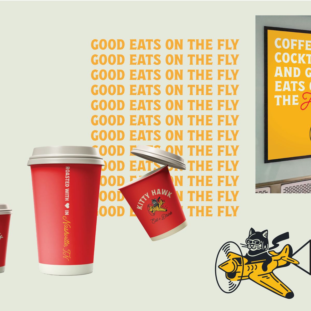
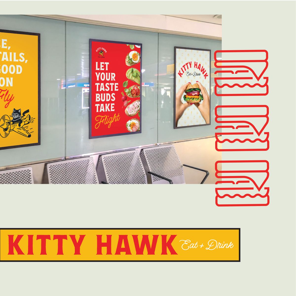
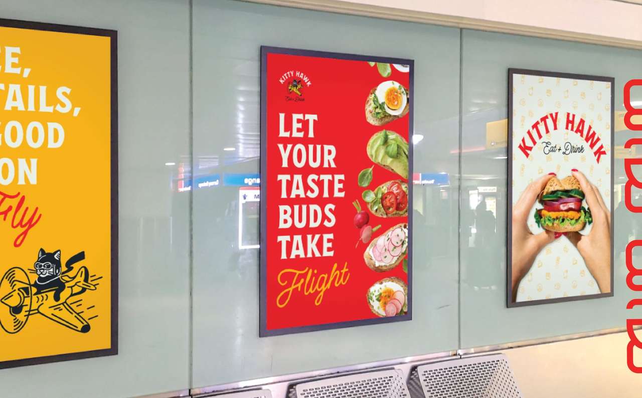
Instagram posts and terminal posters in the voice of the packaging: coffee, cocktails and good eats on the fly.
More hospitality work


Related work


Want this for your business?